Customize Your Own Skin
Mega Menu User GuideMega Menu 3.0 empowers you to create a truly unique navigation experience that perfectly aligns with your brand identity. By offering multiple avenues for adding custom CSS code, Mega Menu caters to a wide range of design needs while maintaining adherence to usability best practices. This flexibility allows experienced designers to craft a navigation menu that not only looks distinctive but also enhances user experience and site functionality.
For CSS-savvy designers and developers, Mega Menu provides 4 distinct methods to incorporate custom CSS code, each suited to different customization goals. This multi-faceted approach ensures that whether you're making minor tweaks or implementing a comprehensive visual overhaul, you have the tools and flexibility to bring your vision to life.
Skin Customization Methods
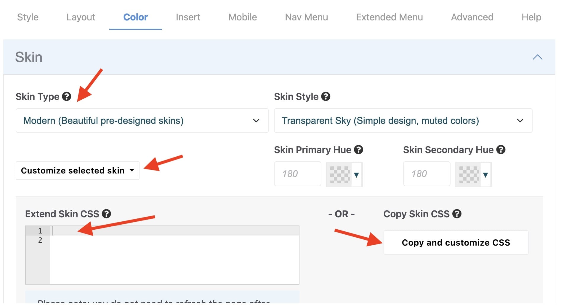
1. Extend an existing Modern skin (recommended):
Color > Skin > Customize selected skin > Extend Skin CSS
Once you’ve set Skin Type to “Modern”, select your preferred Skin Style. From there click the Customize selected skin button to reveal the Extend Skin CSS field. Add your CSS code to customize and extend the active skin without the need to duplicate the entire skin. This way, any future updates to the skin will automatically take effect while respecting your existing customizations. If you’re familiar with WordPress, this is a similar concept to the “Child Theme” – there’s no need to reinvent the wheel. This field will only be activated while the Skin Type is set to 'Modern'. Recommended for small tweaks to a skin.
2. Duplicate an existing Modern skin:
Color > Skin > Customize selected skin > Extend Skin CSS
For full styling control, copy all the CSS code from the selected Modern Skin Style into the Custom CSS field. Click the Copy and customize CSS button and then modify the CSS code as you wish. This is easier than starting from scratch, while offering maximum flexibility and creative freedom. Intermediate CSS knowledge is required. Recommended for major changes to a skin.
3. Start a new skin from scratch:
Color > Skin > Custom CSS
Once you’ve set Skin Type to “Custom”, the Custom CSS field will be revealed. Users familiar with CSS can add their own custom styling. A skeleton template is provided to get you started, but you can customize it as much as you wish. This CSS code will not be overwritten when this package is upgraded in the future, nor will it change if you switch the active site theme. As new features are added to future versions of Mega Menu, additional custom styling may be required for smooth operation. Recommended for advanced CSS designers.
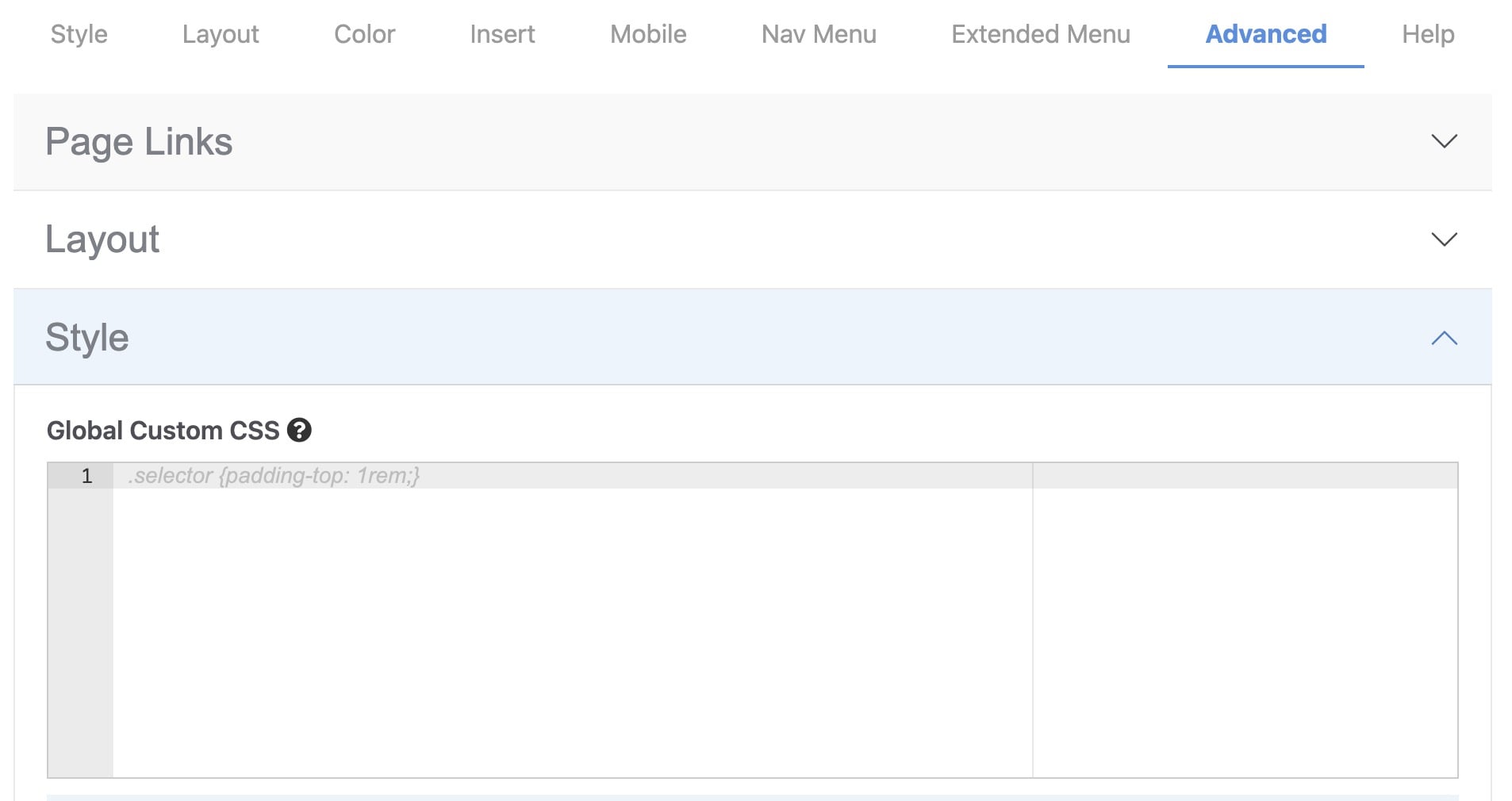
4. Add your own global custom CSS:
Advanced > Style > Global Custom CSS
Designers can customize the styling of the menu or active theme without the need to modify the theme CSS file. This field is intended to be more general compared to the previous options. These customizations will apply regardless of your active site theme or Mega Menu skin. Recommended for tweaks/fixes for 3rd party blocks and themes.
Gain a deeper understanding of Mega Menu’s styling potential. See section: CSS Designer Tips.
Please note that general CSS/HTML/JavaScript/PHP questions fall outside the scope of the technical support included with your Mega Menu license. There are plenty of comprehensive resources on the Internet (many are free) for teaching yourself these skills. The sample code and examples provided in this user guide are only a reference. However, if you want to submit a bug report or make a feature request, we certainly do accept those.
Modern Skin Features & Structure
The Modern skins are built on a similar styling foundation for consistency and easy customization. A few key features to get familiar with:
Automatic Matching Colors
Each modern skin color scheme is built around 1 primary hue, and 1 secondary hue, using the CSS hsl() function. Separating hue, saturation, and lightness is a far more flexible and intuitive way to represent color than the traditional “RGB” (red, green, blue) with HEX colors.
The primary hue, saturation, and lightness are set in 3 global variables:
And the secondary variables are:
All further colors are calculated from either the primary or secondary hue, by adjusting the saturation and brightness. In most skins, the secondary hue is calculated from the primary hue to ensure complementary colors (assuming the Skin Secondary Hue field has not been set). Having a basic understanding of color theory helps.
This HSL approach makes it quick and easy to create a palette of matching colors from a single starting hue.
User-Defined Hues
While each modern skin has a default hue, Mega Menu allows users to set their own Skin Primary Hue to match the styling of their website and brand. This is calculated as a value between 0 and 360 on the color wheel. The Skin Secondary Hue can also be manually set, if desired. This is usually used for highlights and accents in each skin.
If you wish to override the default saturation or lightness global variable for any Modern skin, use the Extend Skin CSS field.
For example:
To convert colors from RGB to HSL, use this free online tool.
Surfaces and Text Colors
For consistent styling between modern skins, 8 “surfaces” are defined as global variables – 6 are based on the primary hue, and 2 on the secondary hue. 8 matching text colors are also defined. A separate set of surfaces and text colors are defined for “light” and “dark” modes.
These are visible when the Color > Skin > Show Skin Demo checkbox is enabled, and the page is in edit mode.
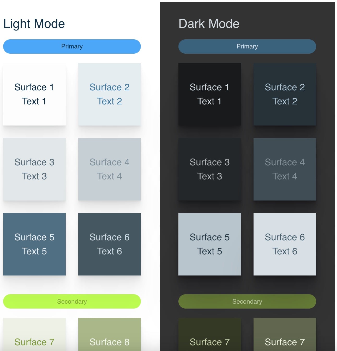
The modern skin automatically takes care of switching between the matching light and dark surfaces, so you can just use 1 single global variable in your custom CSS.
For example:
When making customizations, don’t use --mgm-skin-text1-light or --mgm-skin-text1-dark which are internal global variables, but rather the --mgm-skin-text1 variable.
Here’s a list of variables recommended for use: