Anatomy of Mega Menu
Mega Menu User GuideMega Menu is composed of 6 elements, with all of those being optional except the Dynamic Nav Menu. These element names are referred to throughout this documentation.
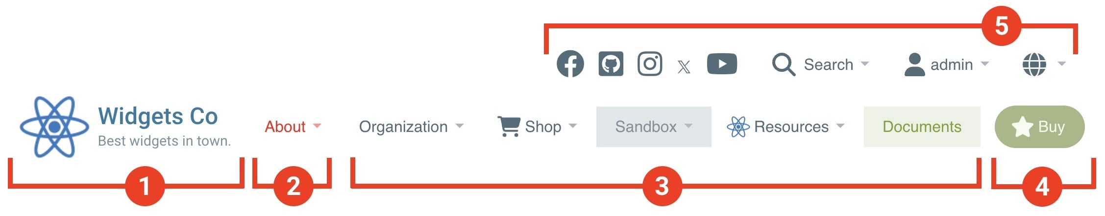
- Logo image and text (with slogan)
- Manual nav menu (before and after Dynamic nav menu)
- Dynamic nav menu (generated from Sitemap)
- Extras (including Call to Action buttons)
- Info Bar
- Hamburger menu (see below)
Note: Elements #2 and #3 are collectively referred to as “Nav Menu”.
Extras
This area is allocated to secondary content and links that do not need to be logically grouped with the Nav Menu. Recommended uses: Call to Action buttons (CTA), Search tool, or Member menu.
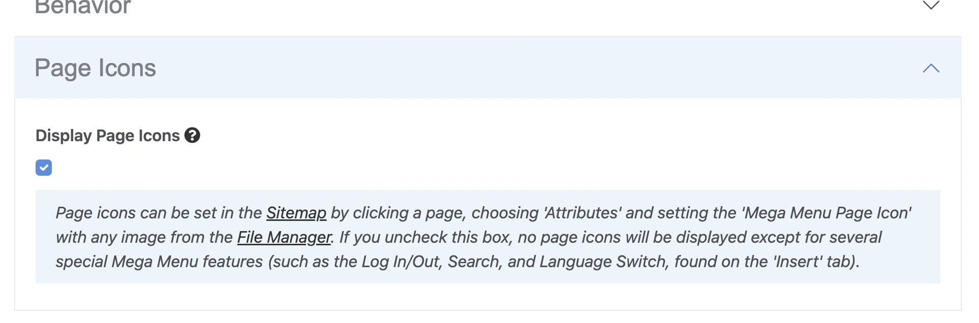
Info Bar
This area is allocated to tertiary content and links that are logically distinct from the Nav Menu and Extras. In addition to built-in features, content can also be pulled from a selected Stack. Recommended uses: Language switch, Search tool, phone number, or social media links.
Hamburger Menu
This optional mobile-friendly simplified vertical navigation menu can be enabled at various common screen sizes. The menu is revealed (and hidden again) by clicking on a “hamburger” icon, and distinctly separate from the primary horizontal navigation menu.
Stacks
Various content across Mega Menu is pulled from Stacks which offers the following benefits:
- Easier user permission control for larger teams and organizations – decide which users have access to modify specific Stacks used by Mega Menu.
- Version control for each Stack, with the ability to roll back to previous versions, independent of the Mega Menu block.
- More streamlined, simpler user interface for easier editing of Mega Menu.
Drop-Down Types
One of two distinct types of drop-down menus are dynamically generated based on the pages within your Sitemap:
- Standard – regular vertical drop-down menu including Level 2 pages.
- Auto Mega – automated horizontal layout with Level 2 and Level 3 pages.
Specific pages within your sitemap can optionally be hidden from the Mega Menu to control which pages produce a Standard or Auto Mega drop-down menu. See section: Page Attributes.
Content from both Standard and Auto Mega drop-downs can be combined with Stack contents in the Extended Menu feature to create an almost unlimited number of layout and content combinations. See section: Extended Menu.
Here are examples:


Editor Interface
The block editor interface is grouped into 9 horizontal tabs, displayed at the top. Each tab contains fields that are grouped together under collapsable headings, providing quick access to specific settings.
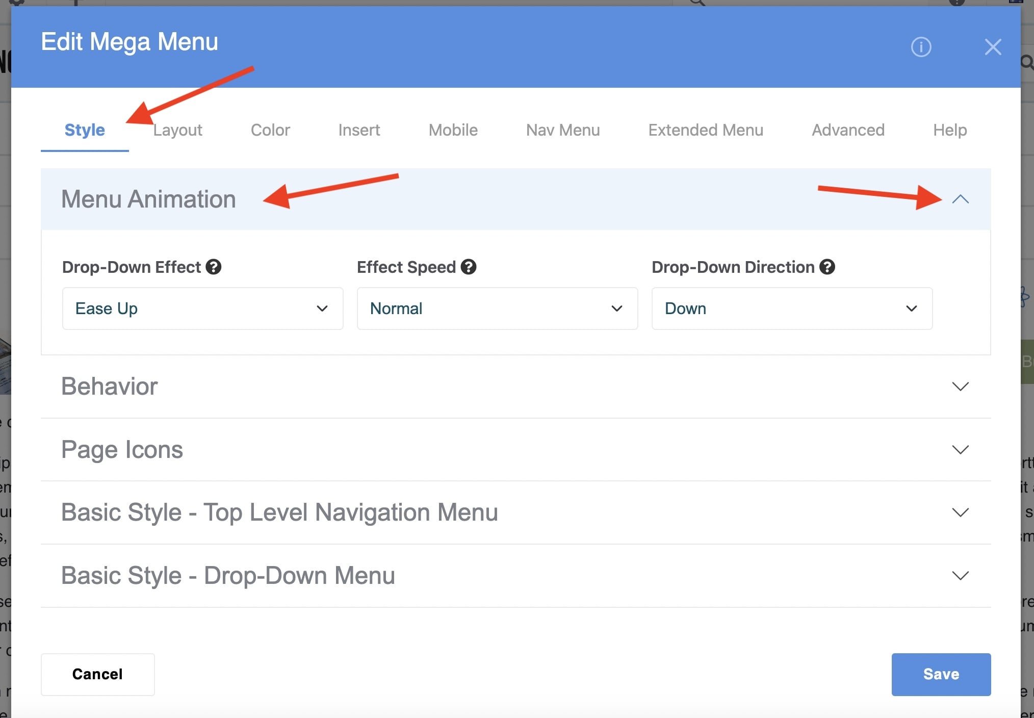
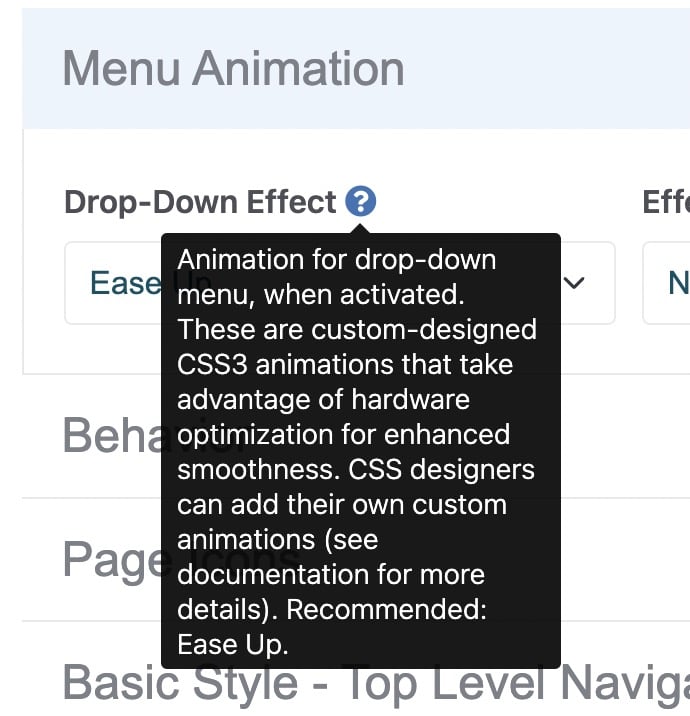
Each field is accompanied by a black question mark tooltip. Hover over it for a detailed explanation of the field.
An inline guide, identifiable by the light blue background, provides additional help. This includes links to relevant areas of your Dashboard (which always opens in a new browser window).