Bonus Blocks – Manual Page List, Manual Panel Nav List
Mega Menu User GuideMega Menu is bundled with 2 new block types for advanced content formatting in Extended Menu: Manual Page List and Manual Panel Nav List.
How to Use - Important
These blocks are only intended to be placed within Stacks used by Mega Menu’s Extended Menu feature - NOT on regular pages - as their styling is inherited from the Mega Menu for improved efficiency to minimise page loading time. When viewed within a Stack, basic formatting will be applied to ease readability. And when viewed on the front-end, in the context of the Mega Menu, these blocks are applied with formatting from the active Mega Menu skin.
Manual Page List
This block is loosely inspired by the core Page List block, but rather than pulling a list of pages from the Sitemap, each item is manually added to a list. There is no limit to the quantity of Manual Page List blocks in any given stack.
Settings
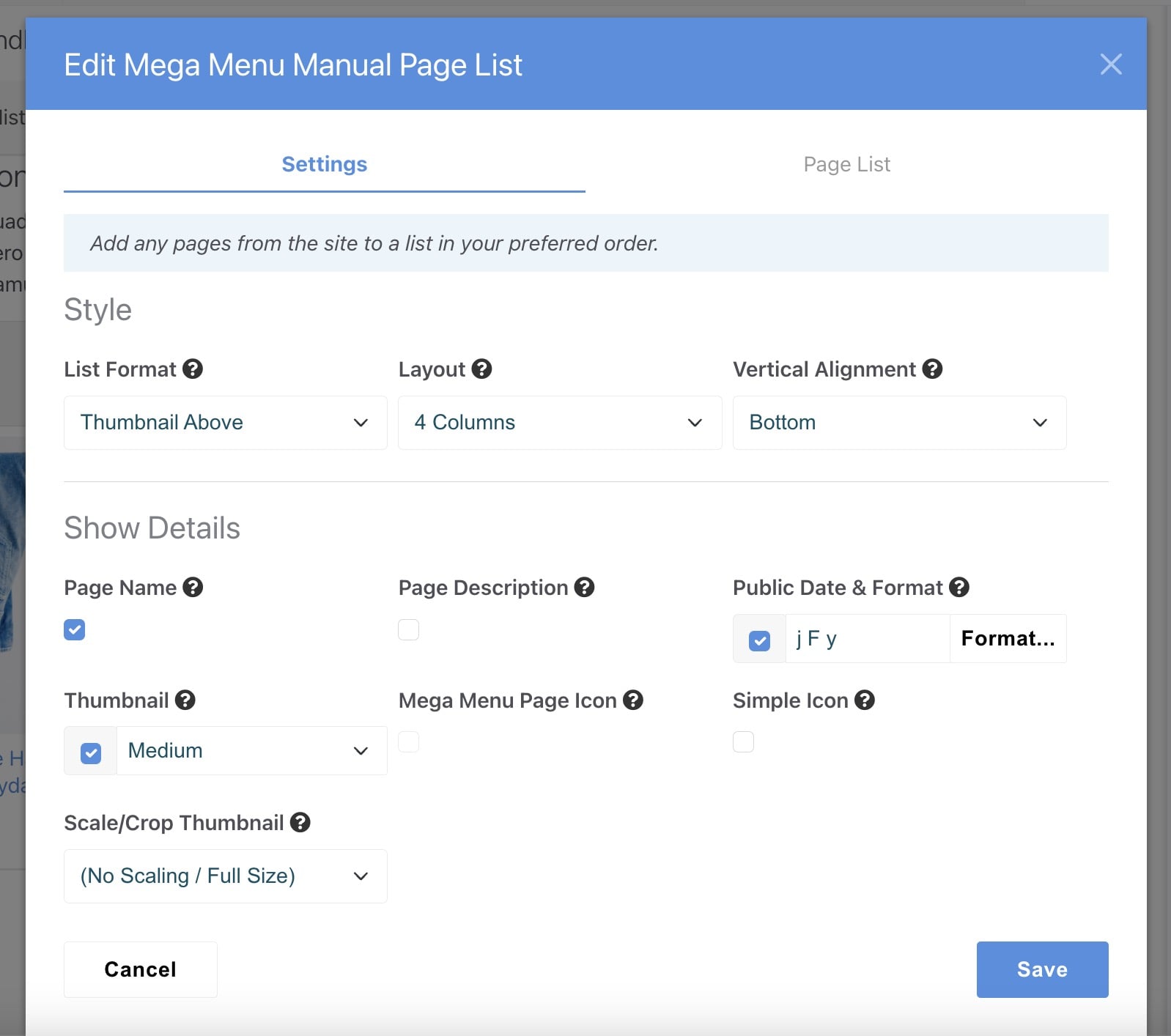
List Format
How to present the list of pages. Each list format will use some or all of the available page details. The “Page Icons Standard” value creates a vertical list of text links that blends in with other Dynamic Subnav content seamlessly. The 3 “Thumbnail” options create a vertical or horizontal list featuring an image with each link.
Note: To avoid confusion, some fields are deactivated depending on the selected value for List Format.
Layout
How to present the list of pages. “1 Column" will create a vertical list, whereas the other options will create columns in a horizontal layout before wrapping around to the next line. To ensure a fully responsive design and follow best practices, the maximum number of supported columns is 6.
Vertical Alignment
The vertical alignment will only have an effect when a List Format other than "Page Icons Standard" is selected and Layout is set to more than 1 column.
Show Details
Page Name
Display the assigned Page Name. This can be optionally overridden on the Page List tab.
Page Description
Display the assigned Page Description, from the page attribute. This can be optionally overridden on the Page List tab.
Public Date & Format
The date when the page was made public. This can be modified from the page attribute. Control the date formatting using standard PHP date parameters. Click the format button to view a guide explaining available options. The default format is “j F y” (eg. 5 March 24)
Thumbnail
Image from the "Thumbnail" page attribute. This can be optionally overridden on the Page List tab. This is not used by the "Page Icons Standard" list format. Sizes are standardized (along with included Page List block templates) for consistency.
Mega Menu Page Icon
Icon image from the page attribute. Only used on the "Page Icons Standard" list format. If your icons are not being displayed as expected, check the Display Page Icons setting within the Mega Menu block.
Simple Icon
This Font Awesome icon can be configured for each page on the Page List tab. It is displayed next to the Page Name.
Scale/Crop Thumbnail
Choose from pre-defined thumbnail sizes set in your Dashboard. See tips below about how to edit your available sizes. Using a smaller size image will reduce page loading time and improve the user experience. If your site supports high DPI thumbnails (it is turned on by default in the Dashboard) then that will be used automatically. If you're unsure how to use this feature, just choose the 'No Scale' option and the full-size image will be used.
Manage your pre-defined Thumbnail Sizes in the Dashboard /dashboard/system/files/thumbnails. To support Retina-friendly high-DPI images, ensure the Create high DPI thumbnails checkbox is active on the Thumbnail Options page /dashboard/system/files/thumbnails/options.
Page List
Each record on this tab is a new list item. To delete a specific item, click the black X icon in the upper right or drag and drop the grey up/down icon in the upper left to re-arrange it. It can be easier to minimize the item by clicking the minus icon in the upper left before rearranging. Click the green Add Page button to add a new item to the list.
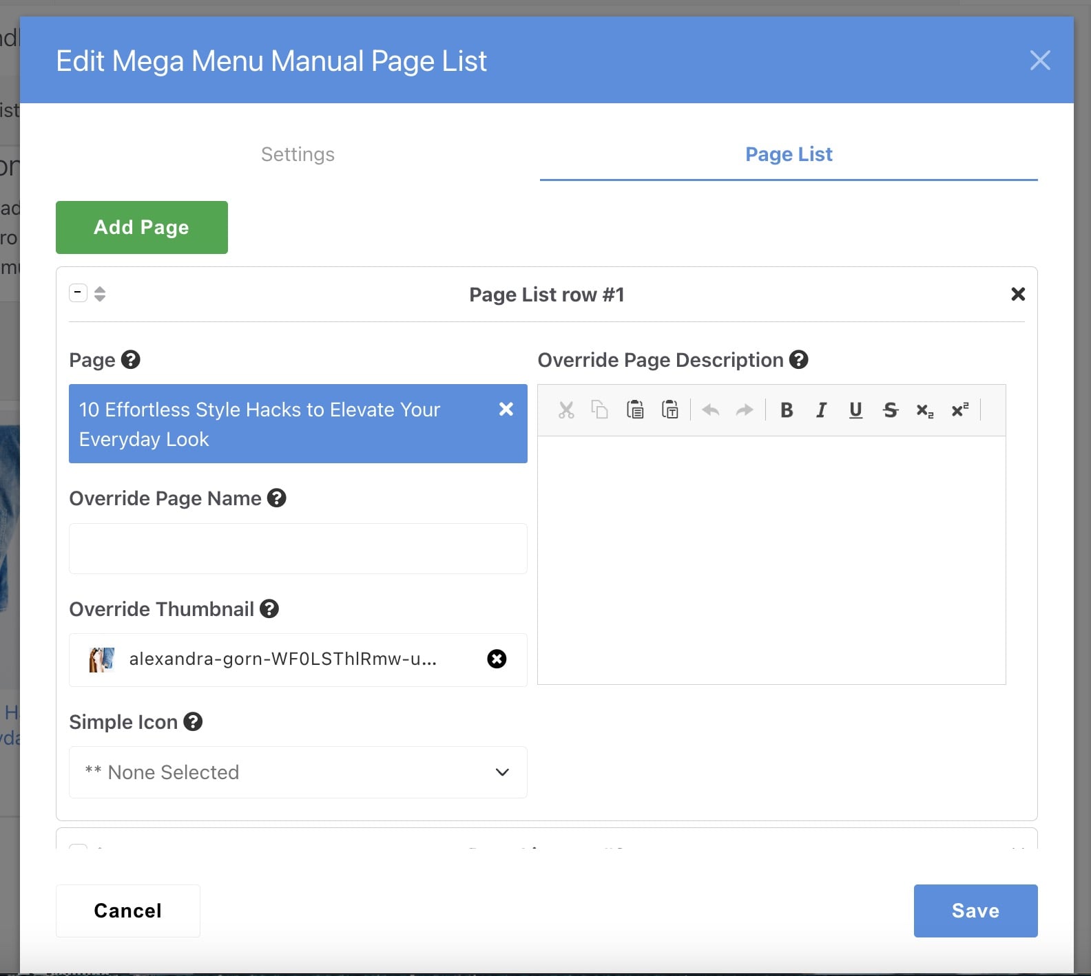
Page
Select a page from your Sitemap to generate a link. Unless you override it with the next field, the built-in page name will be used for the Manual Page List.
Override Page Name
Leave this blank to use the page name, or override it with any page name you prefer. This name will only be used on this block instance.
Override Thumbnail
Leave this blank to use the thumbnail page attribute, or override it with any image from the File Manager you prefer. This image will only be used on this block instance.
Simple Icon
An optional Font Awesome icon. The presentation will depend on the List Format selected. If you know the name of your icon, start typing for an autocomplete list.
Override Page Description
Leave this blank to use the Page Description attribute, or override it with any page description you prefer. This description will only be used on this block instance. It's recommended to keep the page description formatting simple - with only bold and italic. To meet usability best practices, links are not allowed (they will be automatically removed).
Manual Panel Nav List
This is a more advanced navigation element that comprises a vertical list of links that expose panels containing rich content pulled from selected Stacks. You can add up to 6 Stacks per panel, depending on the selected Layout. For most use cases, 1 or 2 Stacks will be sufficient.
The Stack content arrangement is based on the Layout selected, with the first selected Stack being placed in area 1, the second Stack in area 2, and so on. This is similar to the Extended Menu feature in Mega Menu. See section: Extended Menu.
The Manual Panel Nav List block takes up considerable screen space by design. So, it is recommended to manually assign a drop-down menu width that will host this block. From the Extended Menu tab on the Mega Menu editor interface, choose an appropriate Drop-Down Width such as "Segment Width" or "Full Nav Width".
Some of the Manual Panel Nav List settings are similar to the Manual Page List block, so it pays to be familiar with that before using for the first time. To avoid content duplication in this guide, the fields with similar names and functionality will be skipped in this section. Refer to the above Manual Page List section.
Settings
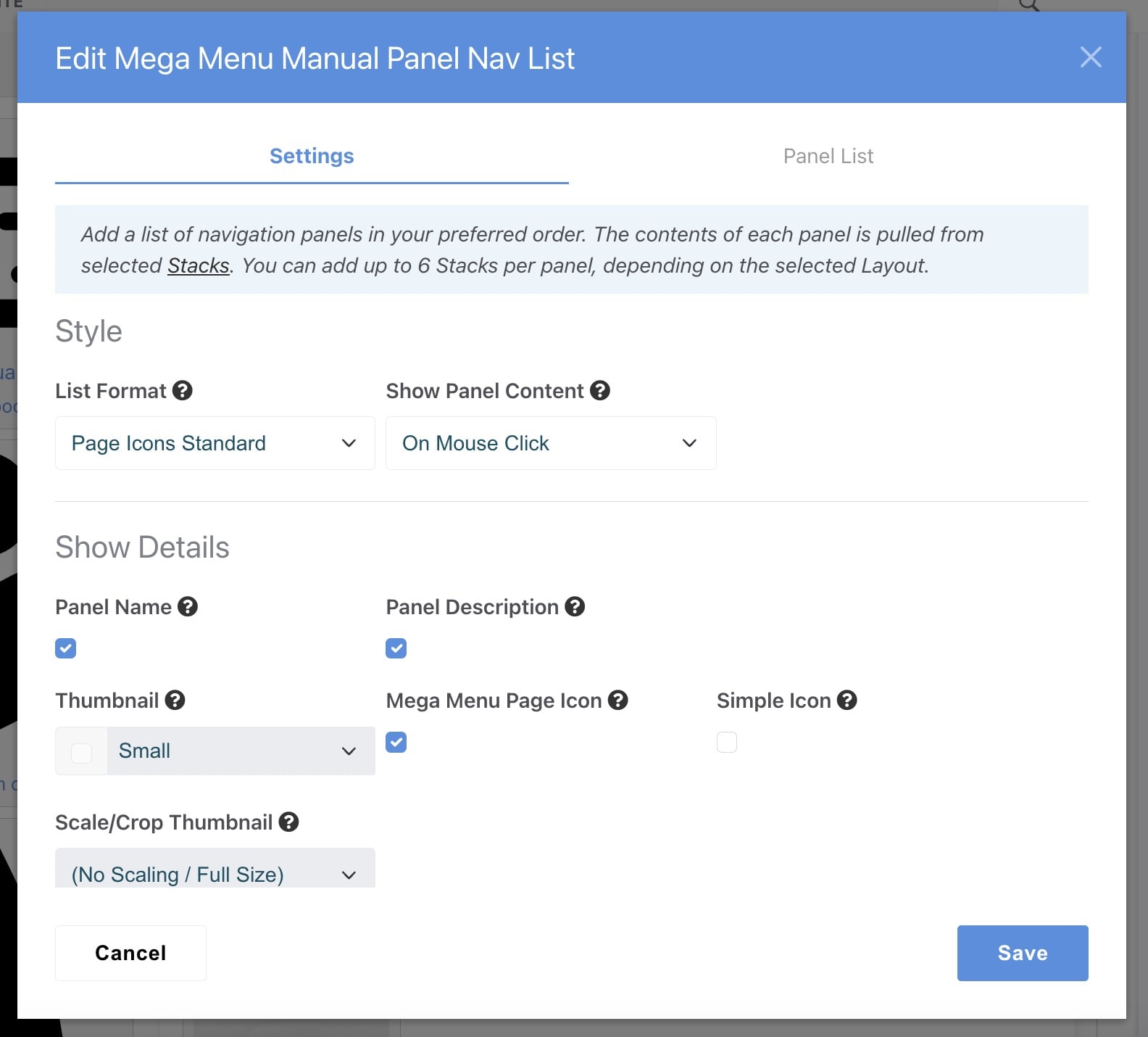
Show Panel Content
When to activate the submenu panel. This is independent of the Show Drop-Down Menu setting in the Mega Menu block. Recommended: On Mouse Hover.
Panel List
Each record on this tab is a new panel item. To delete a specific item, click the black X icon in the upper right or drag and drop the grey up/down icon in the upper left to re-arrange it. It can be easier to minimize the item by clicking the minus icon in the upper left before rearranging. Click the green Add Panel button to add a new item to the list.
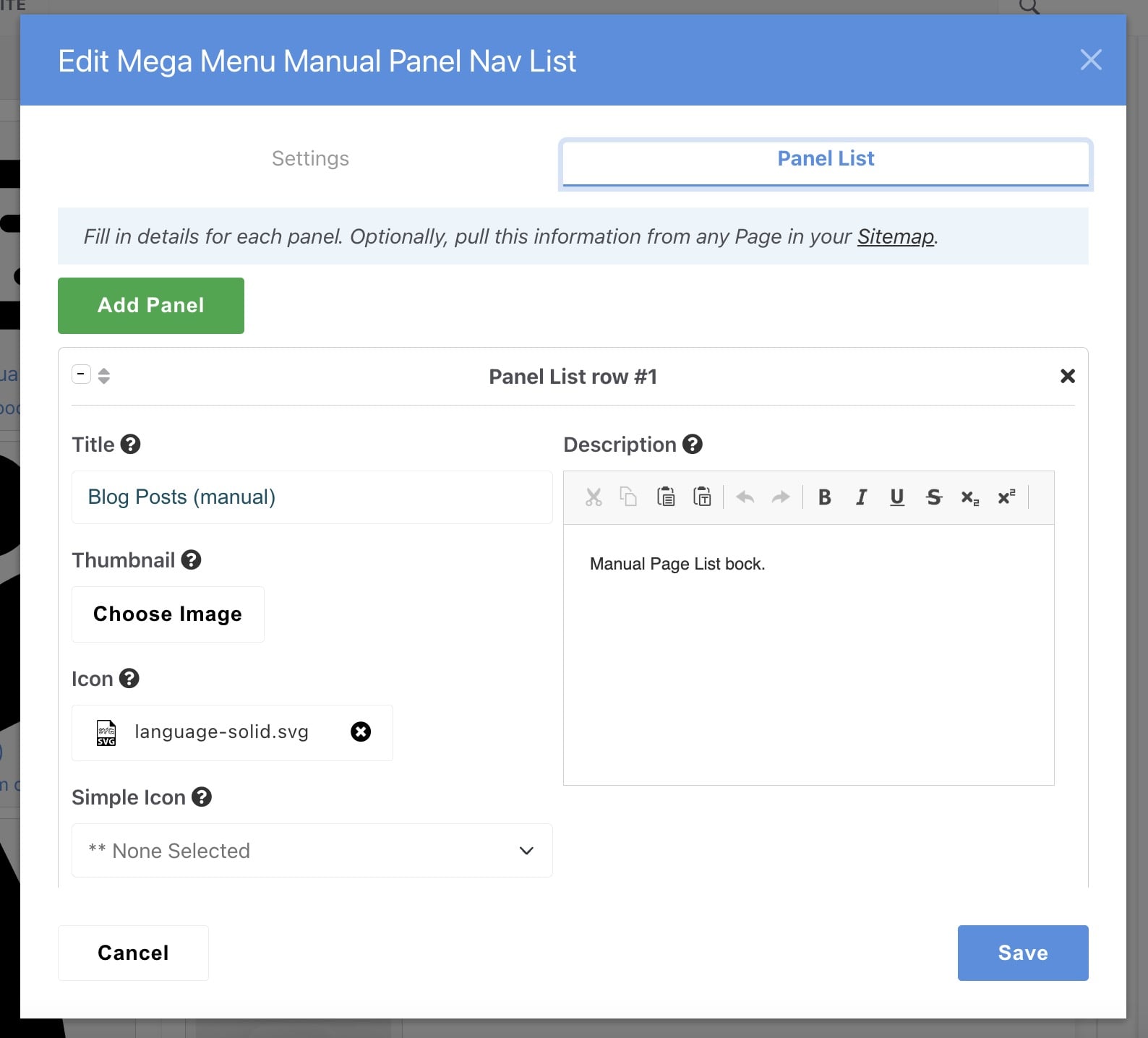
Title
Panel title is shown for each item on the list. There is limited space, so it's best to keep it short and simple.
Thumbnail
Select any image from the File Manager to display next to the Title. This image will only be used if the List Format setting is not “Page Icons Standard”.
Icon
Display an icon next to the panel Title. The size and position of the icon will depend on the active Mega Menu skin (on Color tab). It is best to use simple images with a square ratio (SVG or PNG image format is preferred). This image will only be used if the List Format setting is “Page Icons Standard”.
Simple Icon
An optional Font Awesome icon. The presentation will depend on the List Format selected. If you know the name of your icon, start typing for an autocomplete list.
Description
A short description about this panel, displayed beneath the Title. It's recommended to keep the panel description formatting simple - with only bold and italic. To meet usability best practices, links are not allowed (they will be automatically removed).
Get Info From Page
Optionally select a page from your Sitemap and the Title, Thumbnail, Icon and Description can be pulled automatically. If you leave this blank, you must fill in the Title for the panel to work.
Layout
Control the arrangement of Stack contents within a panel body. Each "area" within the layout is populated by 1 Stack, in the order in which the Stacks are entered (first stack = area 1, second stack = area 2, etc).
Stacks
Select between 1 and 6 Stacks to populate the panel. You can add multiple blocks in each Stack, but best practices recommend keeping the content simple. If you are making changes to your Stack contents in another browser tab, click the Refresh Stack List to see the most current list of Stacks without having to close and re-open the editor window.
To avoid an undesirable infinite loop, if you attempt to use a Stack that contains a Manual Panel Nav List or Mega Menu block, a warning message will be displayed.