Responsive Behavior
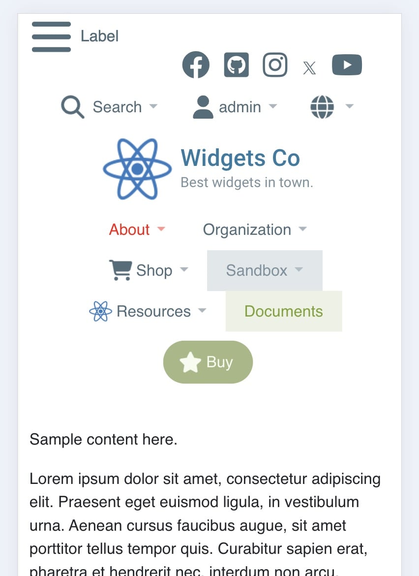
Mega Menu User GuideThe entire Mega Menu framework is fully responsive and will elegantly collapse on smaller screens. Drop-down menu sizing and column width automatically adjust based on the available screen space to maintain maximum readability.
Several fields offer more granular control over the responsive behaviors:
Layout > Prevent Wrapping
If too many menu items are displayed, they wrap to another line by default. This behavior can be turned off if desired. If the search tool is displayed, it will automatically shrink on smaller screens.
Extended Menu > Auto Mega Col.
Control the number of columns in auto mega drop-downs (2nd and 3rd level links that are dynamically generated from your Sitemap). This feature is independent of the Layouts field for the Extended Menu.
Advanced > Default Mega Column Count
The default maximum number of columns used for auto mega drop-down menus. This number can be overridden on a per-menu basis on the Extended Menu tab. The actual number of columns displayed is fully responsive and will be automatically adjusted depending on the available space.
Advanced > Drop-Down Column Width & Alignment
Control the width of columns in auto mega drop-downs. Alignment refers to the column position within the drop-down menu container. This setting is only noticeable when Extended Menu items have their 'width' set to 'Full Screen', 'Menu Width' and 'Nav Width'.
Beyond these, you have the flexibility to choose a mobile-focused layout approach that suits your design and usability goals.
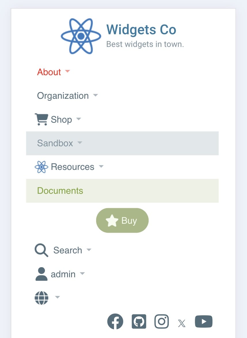
Hamburger
Display a hamburger icon to activate an off-canvas vertical menu. For increased flexibility, you can manually adjust the screen breakpoint width. This style of menu is named 'hamburger' because the traditional three bars in the icon look similar to an outline of a burger.

Responsive
Automatically collapse Mega Menu to a vertical menu on smaller screens. Most of the menu functionality remains the same. The breakpoint is automatically configured for you. Extended Menu content is not displayed due to limited screen space.
Not Sure Which One to Choose?
The Responsive approach is older and works well with smaller, simpler menus. There are no additional options to configure. The Hamburger approach is more modern and works better with larger, more complex menus. This opens up many more configuration options to make the Hamburger menu look and perform the way you want. You can choose one or the other (or neither if you wish). If in doubt, Hamburger is recommended.