CSS Designer Tips
Mega Menu User GuideWhile Mega Menu 3.0 offers a wealth of built-in styling options for non-technical users, it truly shines in the hands of skilled CSS designers. The add-on's extendable structure and meticulously organized codebase provide a solid foundation for advanced customization, allowing you to push the boundaries of navigation design.
Adhering to best practices in HTML and CSS, Mega Menu ensures that all code is standards-compliant, clear and logical. This approach not only facilitates seamless customization but also promotes maintainability and scalability. Whether making subtle tweaks or implementing a complete visual overhaul, Mega Menu's well-structured code empowers you to realize your design vision efficiently while maintaining optimal performance and accessibility.
Browser Support & Compatibility
Mega Menu 3.0 takes advantage of modern features in the CSS standard. All mission-critical CSS code is built on well-established features with a global browser support level of 97% or higher. A smaller amount of non-critical code uses newer CSS features as long as they reach a browser support level of at least 95% to ensure graceful degradation while keeping the code lean and clean.
Mega Menu 3.0 has been tested and is supported on current versions of Google Chrome, Mozilla Firefox, Apple Safari, and Microsoft Edge. Internet Explorer is not supported (no one supports IE anymore).
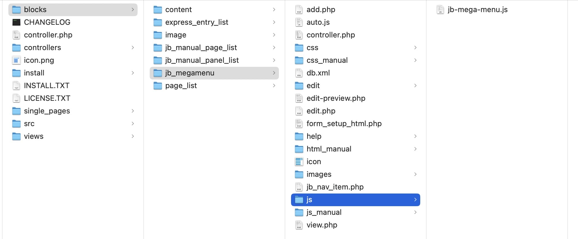
Location of Core Files
To get a better understanding Mega Menu’s inner workings, familiarize yourself with the file structure (all contents are in the /packages/jb_megamenu folder):
Note: It is not recommended to modify any of these files directly. If you want to customize an existing modern skin or create your own custom skin, see section: Customize Your Own Skin.
Build Files
/blocks/jb_megamenu/build/…
The original, un-minified versions of the core CSS and JavaScript files. The files below with “.min” in the name are minified versions and their file size has been reduced to reduce page loading time.
CSS Files
/blocks/jb_megamenu/css/base.min.css
Base scaffolding and styling for menu formatting. All skin options use this. Most global variables are also declared at the top of this file.
/blocks/jb_megamenu/css_manual/hamburger-modern.min.css
Most of the styling for the modern hamburger.
/blocks/jb_megamenu/css_manual/hamburger-classic.min.css
Most of the styling for the classic hamburger.
/blocks/jb_megamenu/css_manual/noscript.css
Graceful degradation of the menu when Javascript is disabled.
/blocks/jb_megamenu/css_manual/skins/modern/…
Modern skin CSS files (1 file per skin).
/blocks/jb_megamenu/css_manual/skins/skin-foundation.min.css
Shared base for flat/glossy skins & MYO style skin.
/blocks/jb_megamenu/css_manual/skins/flat/…
Flat skin CSS files (1 file per skin + shared skin-flat.css).
/blocks/jb_megamenu/css_manual/skins/glossy/…
Glossy skin CSS files (1 file per skin + shared skin-glossy.css).
/ccm/jb_megamenu/mmcss/X/X/X/X
Dynamic external CSS file generated from Mega Menu block settings, and is potentially cached in /application/files/cache/expensive/). This is a virtual file and not found in the server file system. The “X” is replaced with relevant numbers automatically.
JavaScript Files
/blocks/jb_megamenu/js/jb-mega-menu.min.js
Core features of the horizontal menu system, plus Manual Panel Nav List block. Merged with a library for intelligent hover intent tracking on drop-down menus (to reduce the number of files downloaded from server).
/blocks/jb_megamenu/js_manual/hamburger-modern.min.js
Customized library for modern hamburger menu. Only loaded when modern hamburger is enabled.
/blocks/jb_megamenu/js_manual/hamburger-classic.min.js
Customized library for classic hamburger menu. Only loaded when classic hamburger is enabled.
/blocks/jb_megamenu/js_manual/jquery.KeyTips.min.js
Customized library for access key shortcuts. Only loaded when “Keyboard Shortcuts” field is enabled.
/blocks/jb_megamenu/js_manual/inlineSVG.min.js
Library for converting external SVG images into inline images, when "Match Color For SVG Page Icons" field is enabled.
/ccm/jb_megamenu/mmjs/X/X/X/X
Dynamic external JavaScript file generated from Mega Menu block settings, Stack content, and is potentially cached in /application/files/cache/expensive/). This is a virtual file and not found in the server file system. The “X” is replaced with relevant numbers automatically.
Structure of HTML Code – Horizontal Navigation
Mega Menu comprises 6 unique components (See section: Anatomy of Mega Menu).
The horizontal menu system is placed inside a <NAV> element, with a unique ID attribute (in case of multiple Mega Menu blocks on the same page), and a series of CSS classes depending on activated features. This allows more granular conditional formatting control.
The horizontal navigation menu is wrapped by a <NAV> element with a unique ID based on the Concrete Block ID, such as “jbmm-X” (where X is the unique Block ID). This enables multiple Mega Menu blocks on the same page to be formatted and controlled independently. However, only 1 Hamburger menu should be active on a page to avoid conflicts and meet usability best practices.
Each top-level menu item is a <LI> list item within a <UL> unordered list element. Drop-down menus are wrapped with a <DIV> element and comprise further unordered lists or <DIV> elements depending on the content and layout options selected.
Every element within the Mega Menu is assigned a unique CSS class for easy custom styling. The <LI> elements of dynamic top-level navigation items and dynamic subnav items contain a class starting with “pl-X” (where X is the Concrete Page ID).
For more details, see the section below: List of Common CSS Selectors for Customization.
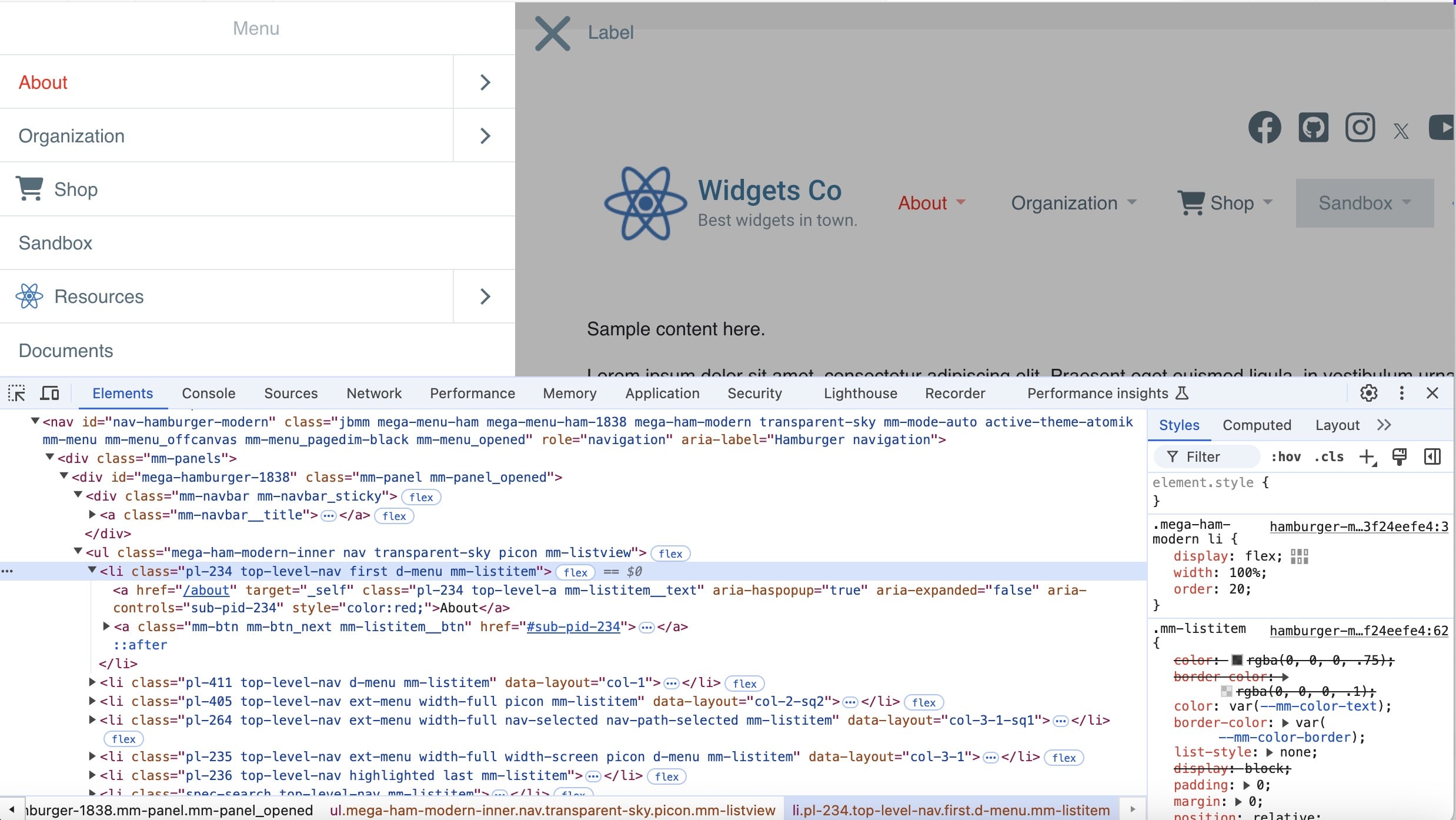
Structure of HTML Code – Hamburger Navigation
When the Hamburger option is enabled, additional elements are automatically added to the page. The naming conventions are based on the selected Hamburger Menu Style.
For “classic”:
- hamburger icon ID: nav-icon-classic
- <NAV> ID: nav-hamburger-classic
For “modern”:
- hamburger icon ID: nav-icon-modern
- <NAV> ID: nav-hamburger-modern
The “classic” hamburger menu is a simple <UL> unordered list, whereas the “modern” menu is made of multiple panels, each containing separate unordered lists.
Extended Menu for Designers
Extensibility is a core principle of Mega Menu. The Extended Menu feature offers a wide range of layouts that cover almost every design requirement. However, to give CSS designers even more flexibility, 5 custom layouts are available (at the end of the Layout drop-down list). Each wrapper <DIV> element is assigned a CSS class (custom-1 to custom-5) to add your own advanced styling. Up to 6 child areas are nested within each layout (class a-1 to a-6). These elements use Flexbox for limitless potential layout combinations.
For example:
If you wanted to select the first area of “Custom 1” layout, the CSS selector would be:
If you assign the same custom layout to more than 1 Extended Menu item, they will all share the same format and layout unless your CSS selector uses a specific page ID.
For example, if the top-level page ID is 234:
Custom Drop-Down Effect for Designers
A handful of custom-made animations are available in the “Drop-Down Effect” field (Style > Menu Animation). CSS designers can create their own effect by setting that field to “Custom” and adding CSS code to the “Global Custom CSS” field (Advanced > Style) or in the active site theme’s CSS file.
Use the .jbmm.menu-effect-custom CSS selector for your animation. It only takes 2 lines – one for the default behavior of the .sub-container, and the other for an animation when the container is shown (the .mm-show class is added and removed dynamically):
For example:
This moves the .sub-container up and fades in when activated, using the speed from the Effect Speed field. Optionally, if you want to support the Drop-Down Direction field, add this line:
The animation movement will reverse along the Y axis (up and down), so it slides down instead of up when the Drop-Down Direction is set to “Up”.
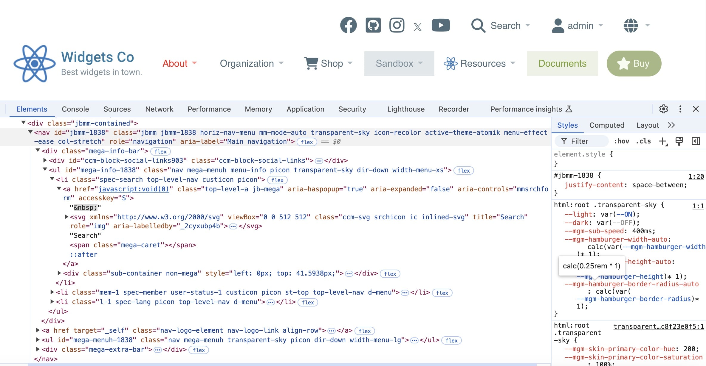
Global CSS Variables
Mega Menu 3.0 uses CSS variables to make theming more flexible and extendable. The majority of these are set in base.css. The naming conventions are pretty straightforward, and inline comments are included to explain the purpose of each.
For example, for outer margin around sub menu:
It is important that you do not change the units for each global variable, as these may be used in CSS mathematical calculations. Most sizing is based on “rem” - relative to the root element's font size (for improved scalability and accessibility) - while others are based on “px” for more precise fixed sizing.
These variables can be overridden in the dynamic external CSS file (based on selected block settings), or the active Modern skin’s CSS file. Each Modern skin also introduces several new variables. Most of these are uniform across all Modern skins, such as --mgm-link-color. For a more detailed explanation, see section: For Theme Designers.
You can override these global variables in the Extend Skin CSS, Custom CSS or Global Custom CSS fields. See section: Customize Your Own Skin.
Dark Mode Support
Mega Menu uses global CSS variables to handle operating system Dark Mode support with zero reliance on JavaScript. This makes customizing your own skin much easier. The technique employed uses a conditional var() function.
Two global variables that control Dark Mode are --light and --dark. These are switched on or off automatically inside the Dynamic external CSS file by reading the media query “prefers-color-scheme”.
Those 2 global variables can be read by any other built-in or user-defined variables to create a simple condition.
For example:
The variable --mgm-outline-color is set to rgba(0,0,0,0.8) when light mode is enabled (default), and rgba(255,255,255,0.8) when dark mode is enabled. Make careful note of the commas and spaces. For consistency, placing the “light” formatting before the “dark” is recommended.
For improved readability, most CSS code for Modern skins sets light/dark options in global variables defined before the majority of the CSS statements.
CSS Specificity
Mega Menu follows CSS best practices to ensure the code is robust and extendable. The base.css uses broader CSS selectors to allow easy overriding by skins, but is also specific enough to prevent conflicts with the active theme’s CSS or other blocks. Use of the “!important” property is avoided as much as possible to ensure code is logical and easy to understand. While Mega Menu strives to adhere to best practices, the potential for CSS clashes can never be completely eliminated when using blocks and themes created by different 3rd party developers for Concrete CMS. For suggested steps to investigate a potential CSS clash, see section: Troubleshooting.
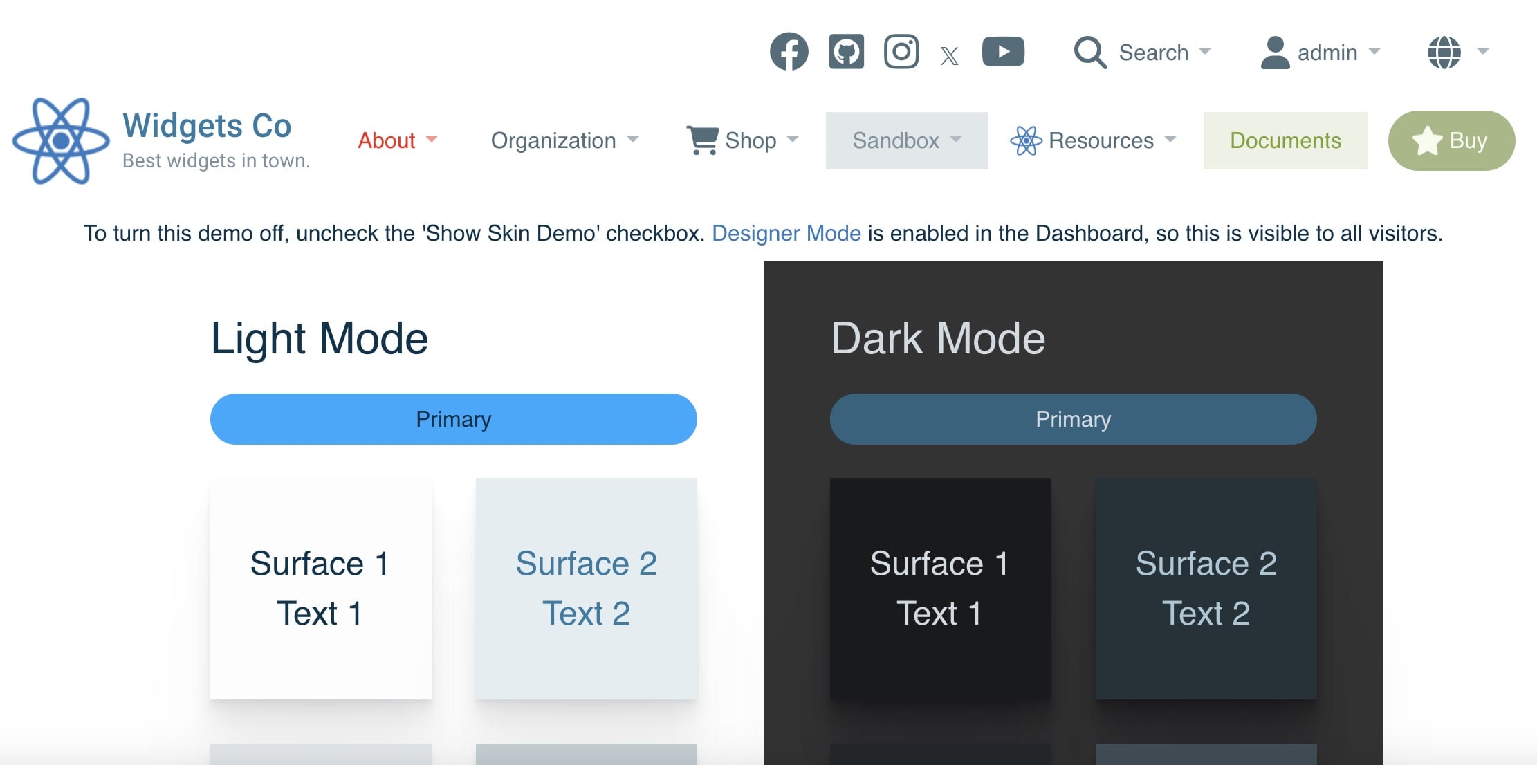
Designer Mode (Dashboard)
Designing your own Mega Menu skin can be a fun, creative process. To make it easier, the Color > Skin Show Skin Demo field, when enabled, displays a set of “surfaces” and text colors for the active modern skin (based on the selected or default Skin Primary Hue and Skin Secondary Hue) – but only while the page is in edit mode. This demo is automatically hidden when the page is no longer in edit mode, as you never want your website visitor to see this.
However, while your site is in development mode, viewing the Skin Demo when the page is not in edit mode can make styling your skin easier as you can access the full Mega Menu experience, including drop-down menus. This is activated by checking the Enable Designer Mode field in Dashboard > Mega Menu > Settings.
Remember to disable Designer Mode when you have finished styling your Mega Menu skin.
List of Common CSS Selectors for Customization
Mega Menu uses dozens of CSS classes – both static and conditional – to enable granular formatting control and customization. Viewing the source HTML using Google Chrome DevTools is recommended to identify the code structure, target CSS classes, and test on-the-fly code changes. It is expected that CSS designers will have adequate experience and knowledge to accomplish this - it is beyond the scope of this user guide to explain each CSS class. However, as a starting point, below is a list of the most commonly used selectors for skin customization:
Wrapper
.jbmm
Applied to the top-level <NAV> element wrapping the Mega Menu. It is best practice to use this for ALL selectors to ensure specificity and to avoid undesired conflicts with other CSS code on your page.
.horiz-nav-menu
When the Hamburger menu is enabled, use this class on the <NAV> element to exclusively target the primary horizontal navigation menu.
.mega-info-bar
Element wrapping the Info Bar.
.mega-extra-bar
Element wrapping the Extras.
.picon
Used at several levels of the menu structure. At the higher levels (such as an <UL>) it signifies that the “Page Icon” feature is enabled. At lower levels (such as a <LI>) it means the current menu item has a page icon set, and padding is adjusted accordingly.
Unordered List
ul.mega-menuh
An unordered list for each “segment” of the Mega Menu. For increased specificity, combine with the parent class (such as .mega-info-bar ul.mega-menuh) or additional class on the same element (such as ul.mega-menuh.menu-info).
.dir-down or .dir-up
Used on the top-level <UL> element, this indicates the value of the Drop-Down Direction field. Formatting of the drop-down menu tail, and positioning of the menu automatically adjusts.
.width-menu-XX
A dynamic class assigned to top-level <UL> elements based on the width of the segment. XX values are based on Bootstrap naming conventions and the following breakpoints: xl (> 870px), lg (> 700px), md (> 550px), sm (> 490px), xs (<= 490px). This facilitates automatic drop-down width and positioning and based on browser window size.
Unordered List Item
.top-level-nav
Top level <LI> element within the .mega-menuh unordered list.
.d-menu
Dynamic subnav is available.
.mega-hover
When the drop-down menu is activated, this class is temporarily added. It is removed when the drop-down menu is hidden.
.first and .last
The first or last dynamic <LI> element of the parent <UL>.
.ext-menu
Extended Menu is enabled for the top-level <LI> element.
.nav-selected
The menu item is the current page being viewed.
.nav-path-selected
The menu item is within the nested path of the current page being viewed (such as a parent or grandparent page).
.highlighted
If a page attribute, “Mega Menu Highlight Page”, is checked, this class is added to allow custom styling.
.jb-mega-li
Top level <LI> of an Auto Mega drop-down menu.
.pl-X
Every dynamic page link generated from the Sitemap is assigned a unique class based on the Page ID. You can view the Page ID from Dashboard > Sitemap > Attributes. This allows precise formatting for specific pages and content in the Mega Menu.
.mega-divider
If a page attribute “Mega Menu Subnav Divider” is set, this class is applied to a <DIV> inserted above or below the selected page <LI>. This class also applies to the included Page List block templates.
Links & Subnav
.top-level-a
Top level <A> inside an <LI>. Used for granular targeting of top-level menu links.
.sub-container
Wrapping <DIV> element around each drop-down menu. Use this selector to only target elements inside a drop-down.
ul.sub_menu
Dynamic Subnav list of pages generated from the Sitemap. This is different from elements that are added via Extended Menu.
.area-container-wrap
Extended Menu content is wrapped in a <DIV> and assigned to this class.
.area-container
Each child <DIV> of the .area-container-wrap wrapper is assigned this class along with .a-1 to .a-6 depending on the area within the layout (.a-1 is the first area, .a-2 is the second area, etc).
Extra Features
.spec-search
Top level <LI> element for the site search feature, if enabled.
.spec-member
Top level <LI> element for the member drop-down feature, if enabled. The user login status is accessible via .user-status-0 (not logged in) or .user-status-1 (logged in).
.spec-lang
Top level <LI> element for the language switch feature, if enabled.
.sl-1
Top level <LI> element for the simple manual link feature, if enabled. .sl-2 for the second link.
.cta-1
Top level <LI> element for Call To Action (CTA) feature, if enabled. .cta-2 for the second link.
Add Padding, Margins & Borders to Blocks
While you can add custom CSS using the methods outlined in the section Customize Your Own Skin, the cleanest and most scalable solution for adding padding to blocks within your Extended Menu is pre-built CSS classes. You can choose from 2 sources:
Method 1) If your site theme is built on Bootstrap, then you have an array of utility classes available for padding, margin and borders. For example, pt-4 adds padding to the top of the block at 100% of the default spacer size, and pb-4 adds bottom padding (see Bootstrap documentation).
Method 2) Mega Menu includes a suite of basic utility CSS classes for padding, margin and borders. Padding and margins are based on a calculation using the --mgm-util-spacing global variable. By default, this is set to match the outer margin around the drop-down menus (which can be overridden in each Modern skin). This makes it easier to ensure any CSS customizations match the same proportions for visual continuity while maintaining flexibility. The border thickness and color is determined by the active Modern skin, however you can override it using the following global CSS variables: --mgm-util-border-thickness and --mgm-util-border-color.
The CSS class format for padding and margin is: mm-{property}{side}-{size}
Property is:
- p: padding
- m: margin
- b: border (no “Size” support, to keep the CSS file size as small as possible)
Side is:
- (blank): all sides
- t: top
- b: bottom
- s: start (left in LTR, right in RTL)
- e: end (right in LTR, right in RTL)
Size is a range of numbers from 1 to 6, plus m, at the following ratio of --mgm-util-spacing:
- 1: 100%
- 2: 150%
- 3: 200%
- 4: 300%
- 5: 400%
- 6: 700%
- m: 100% of --mgm-sub-margin CSS global variable (the actual value will dynamically change depending on the active Modern skin)
Examples:
- mm-p-1: 100% padding on all directions
- mm-pt-2: 150% padding on top
- mm-ps-3: 200% padding on start (left)
- mm-pe-m: dynamic match padding on end (right)
- mm-m-2: 150% margin on all directions
- mm-me-4: 300% margin on end (right)
- mm-b: border on all directions
- mm-bb: border on bottom
Note: To override the ratio for the dynamic “m” Size, set the CSS global variable --mgm-util-spacing-match-ratio (use whole or decimal number only). The default value for this variable is 1.
Apply Utility Classes
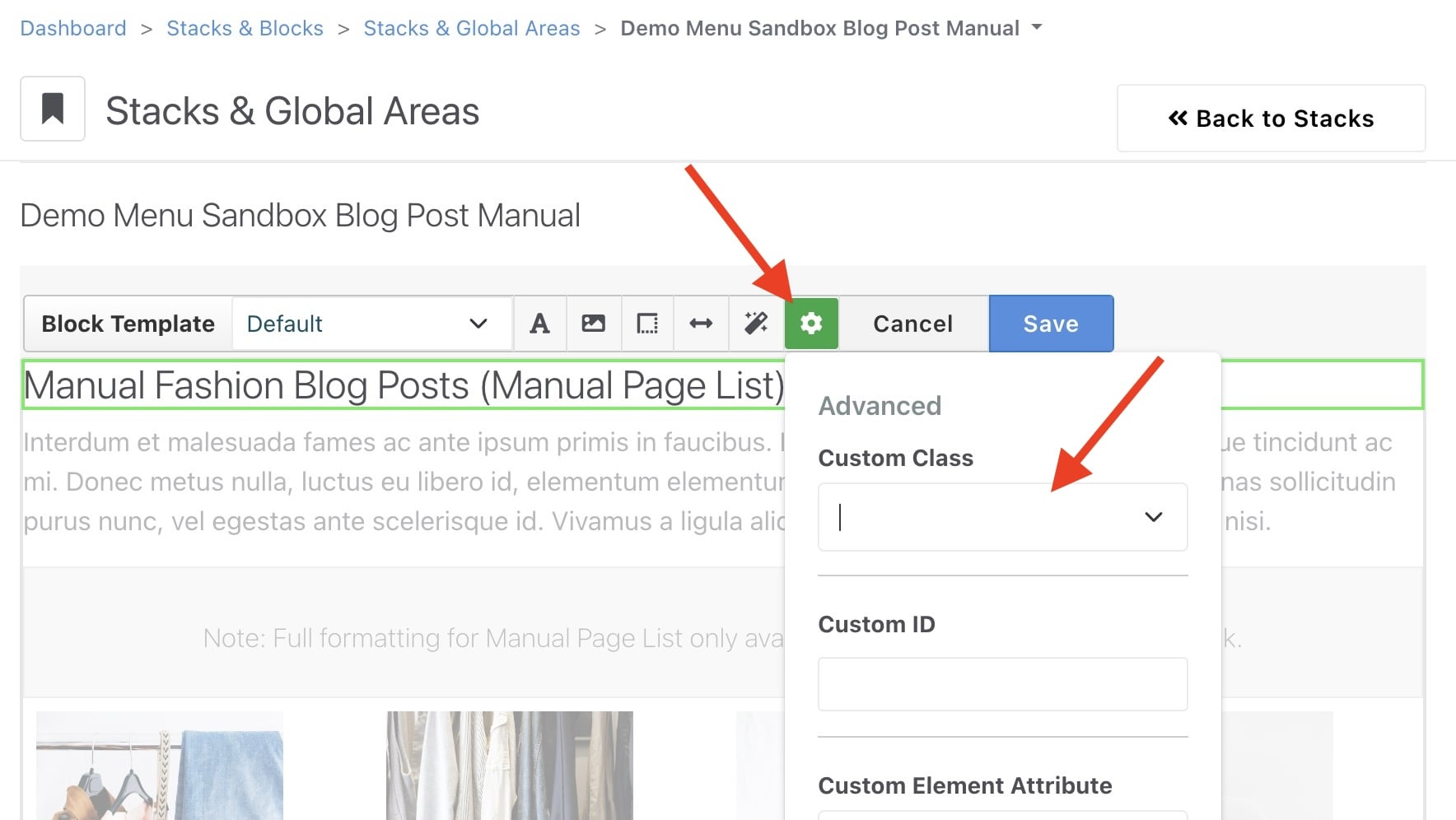
To apply utility CSS classes, find your Stack (used within Mega Menu), click the block and choose “Design & Block Template”. Click the “cog” icon and add your “Custom Class” then press “Save”. Read the Concrete documentation for details.
Menu Icons
You can add any kind of web-compatible image as a page icon (via page attributes) and for special features like Members and Site Search. There are endless options for free and paid icons on the internet. A few recommended resources to start your search:
- Font Awesome (used in the Mega Menu demos)
- Flat Icon
- Freeicons.io
- Freepik
- Icons8
- IconFinder
- UXWing
Some important advantages and disadvantages of each file format:
PNG:
- Advantages: Easy to convert from existing raster images (JPG, GIF, BMP, etc), transparency support.
- Disadvantages: Larger file size, may notice pixelation on high-DPI displays.
GIF:
- Advantages: Supports animation.
- Disadvantages: 256 color limit, larger file size.
SVG:
- Advantages: Smaller file size, faster loading, highest definition.
- Disadvantages: Harder to convert from existing raster images, limits in CSS standard for recoloring.
Note: Web browser standards treat SVG images as a separate DOM (from the rest of the web page), which means regular CSS formatting cannot be applied – this is a limit inherit in the CSS standard. Mega Menu uses a workaround: converts any external SVG images into inline images using JavaScript. The drawback is there is a very short “flash of hidden icon” as the page loads. The advantage is that the image can be easily re-colored using CSS.
Menu Fonts
When styling your menu, there are over 1,500 Google Fonts to choose from, so there’s no shortage of choice. To help make your design decisions easier, below is a list of recommended fonts that look good with Mega Menu:
- Open Sans (sans serif)
- Lato (sans serif)
- Inter (sans serif)
- Titillium Web (sans serif)
- Nunito (rounded)
- Quicksand (light rounded)
- Playwrite DE Grund (rounded)
- Rubik (square)
- Merriweather (serif)
- Poppins (wide)
- Roboto Condensed (narrow)
- Bebas Neue (block, capitals)
- Luckiest Guy (block)
- Patrick Hand (handwritten)
- Indie Flower (handwritten)
- Permanent Marker (block handwritten)
Google Fonts note: When selecting Google Fonts on the Logo Text Brand and/or Brand Slogan fields Layout > Logo Text, Mega Menu will only load the exact characters of your logo/slogan at the selected font weight to ensure the smallest possible download size. Pre-fetching code is automatically added to the <HEAD> of your page to speed up the connection to Google’s servers.