Extended Menu
Mega Menu User GuideMega Menu's Extended Menu feature revolutionizes your site's navigation, offering an unprecedented level of customization and flexibility. This powerful tool allows you to create rich, dynamic drop-down menus that go far beyond simple lists of links.
With Extended Menu, you can incorporate up to 6 Stacks per drop-down, each capable of hosting multiple blocks. This versatility enables you to craft intricate layouts that combine various content types, from text and images to advanced features like accordions and event lists. The result is a navigation system that not only guides users but also engages and informs them.

Layout Basics
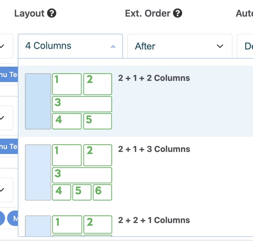
The Layout options in Extended Menu are both diverse and intuitive. Choose from a range of pre-designed layouts optimized for both standard vertical menus and horizontal mega menus. The Stack content arrangement is based on the Layout selected, with the first selected Stack being placed in area 1, the second Stack in area 2, and so on.
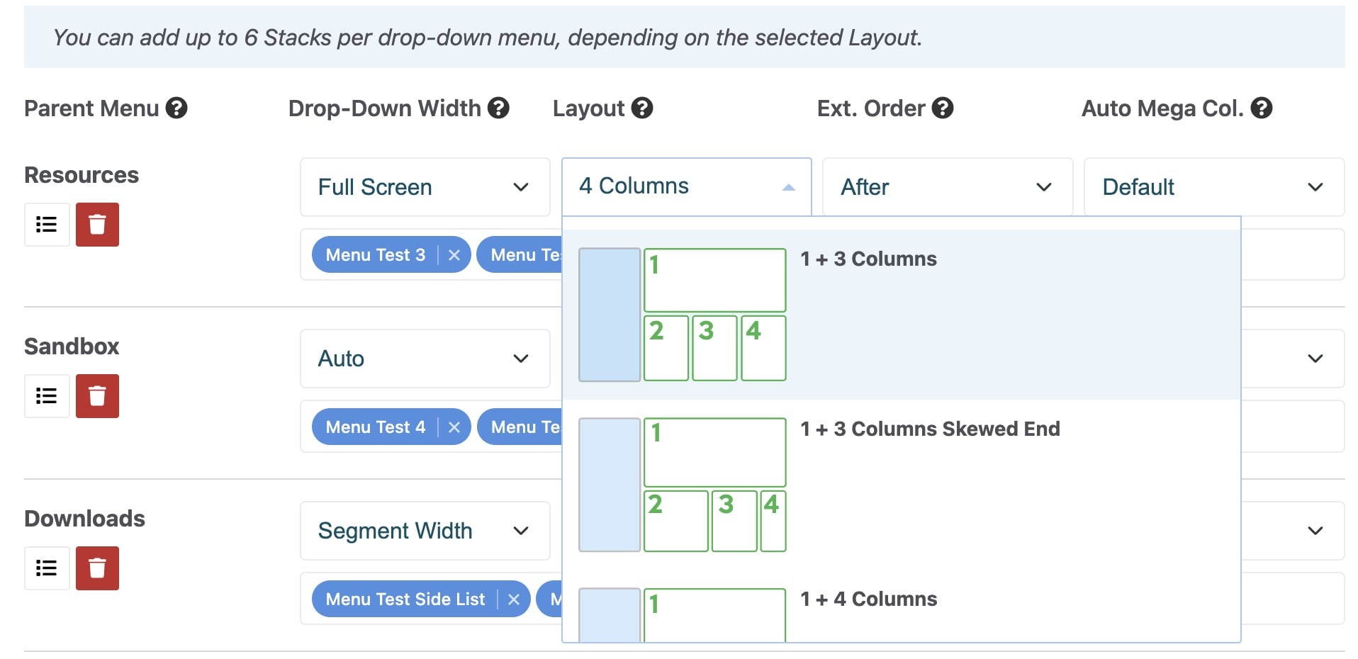
The use of blue boxes in the layout icons makes it easy to visualize how your Dynamic Subnav will integrate with Extended Menu content.
The first group of layouts (with a vertical blue box) are optimized for Standard menus – a vertical list of links.
The second group of layouts (with a horizontal blue box) are optimized for auto Mega menus - a horizontal list of links.
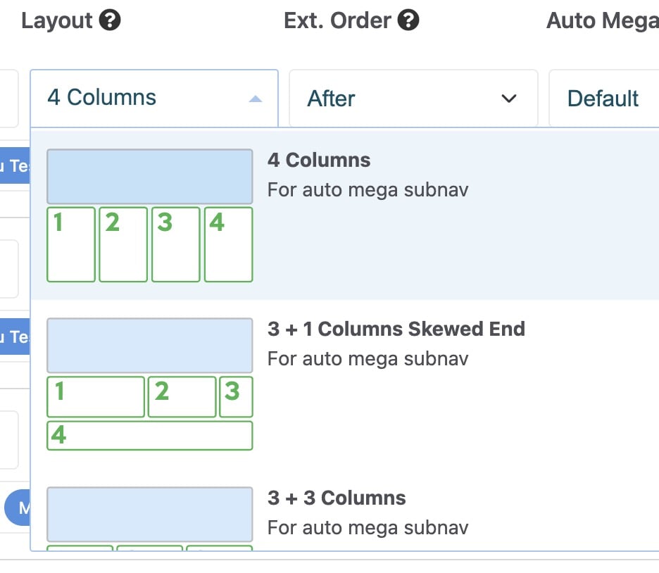
Layout Arrangement
All inserted Stack elements can be placed “after” or “before” the Dynamic Subnav with the Ext. Order field. For the first group of layouts (designed for Standard drop-downs), this is to the left/start or right/end. For the second group of layouts (designed for Auto Mega drop-downs), this is above or below as they are already using up all available horizontal space.
Advanced Layouts
For those seeking ultimate control, advanced layout options allow up to 6 columns (with no Dynamic Subnav). 5 custom layout options are available for CSS designers to add their own advanced styling. The wrapping <DIV> elements are assigned a matching CSS class (from “custom-1” to “custom-5”), and each Stack child element is wrapped by a class (from “a-1” to “a-6”).
Note: If you choose the same custom layout (eg. Custom 3) for multiple Extended Menu items, they will all maintain the same customized layout.
Which Blocks to Use in Extended Menu
Mega Menu has been designed and tested for these specific core blocks:
- Content (with 1 custom block template included)
- Page List (with 28 custom block templates included, see below)
- Image
- Horizontal Rule
- Feature Link
- Feature
- Accordion
- Topic List
- Social Links
- Express Entry List
- Share This Page
- Event List (Calendar)
To complement these, 2 additional blocks are included with Mega Menu: “Manual Page List” and “Manual Panel Nav List”. See section: Bonus Blocks.
Other blocks from 3rd parties may work on Mega Menu, but we are unable to offer technical support for them. The supported core blocks and 2 bonus blocks cover the vast majority of Mega Menu's use cases.
Note: due to HTML rendering limitations in web browsers, a block that displays an <EMBED> element (such as a video) or <SCRIPT> element will not work correctly within a layered navigation menu like Mega Menu.
Included Block Templates
Page List
The included Page List custom block templates are named according to their layout.
For example:
- Mega Menu Page Icons Standard 4 Columns
- Mega Menu Thumbnail Above Horizontal 3 Columns Center
- Mega Menu Thumbnail Above Vertical List Center Medium
- Mega Menu Thumbnail Side Vertical List Medium
All included Page List block templates can be grouped into 2 basic styles:
- Page Icons Standard – a basic list (either vertical – with 1 column, or multiple columns) that replicates a Standard drop-down (with support for Page Icons).
- Thumbnail – a list with the page title and thumbnail (pulled from the Page Attribute), with options for thumbnail positioning above or to the side of the page title. Ideal for a list of products or blog posts.

Block template naming conventions are the same for the “Manual Page List” block. See section: Bonus Blocks.
The block templates respect most options from the core Page List block, such as Include Page Description, Include Public Page Date (useful for blog posts), and Sort. However, several irrelevant features are not respected to maintain best practices, such as Pagination, Provide RSS Feed, and Title of Page List.
Content
Mega Menu’s HTML structure relies on unordered lists (UL) to follow best practices and improve search engine friendliness. By design, the default HTML bullets are hidden. However, if you wish to display a regular bullet list (UL or OL) within a Content block used by a Stack in Extended Menu, apply the “Clean Bullets” block template.
Image
To automatically scale and crop an image to use the full available height or width within a drop-down menu, use the included Image block templates:
- Cover Height: Stretch image height to 100%, crop width
- Cover Width: Stretch image width to 100%, crop height
Note: to work correctly at all screen sizes, the rendered image dimensions should be larger than the surrounding space, allowing the web browser to scale down and crop the image for you automatically.
Search
While the core Search block works fine for a search results page, a block template called "Results Only" is included with Mega Menu to give your search results a cleaner, more minimal treatment without any obtrusive search text field.
Express Entry List
Some features of this core block do not meet usability best practices in the context of a navigation menu. The included “Cleaned for Mega Menu” block template removes a non-essential feature, sortable column heads, and a small portion of JavaScript. The rest of the functionality remains unchanged.